The Amex Offers page is probably the most view portion of the American Express website for cardholders. I mean, how many people login every day (sometimes a couple of times a day) to just look at their balance or minimum payment information? 🙂
The Newly Redesigned Amex Offers Page – For The Good!
The Amex Offers page has been full of some pretty good, new offers lately but the new design that Amex had rolled out was terrible. If you spent any amount of time on the page, you know that you missed the old one and links popped up that would give you that old view back.
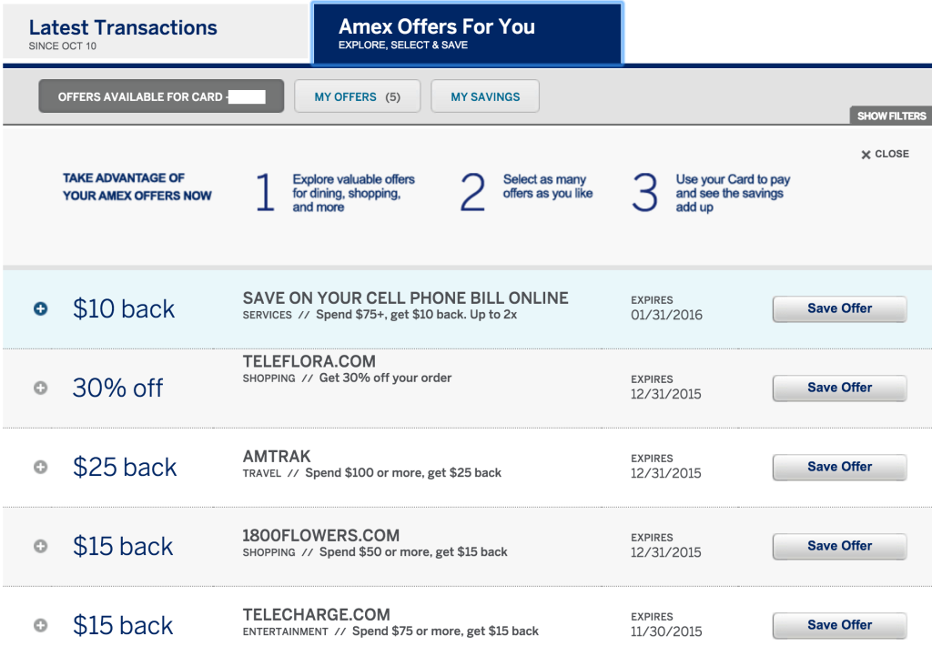
The Older Amex Offers Page
The old one was functional – not pretty at all. It gave you the name of the retailer, the offer, and the expiration date with a drop down option to see the terms and details. With one push of the Load More button, you could see everyone of the available Amex Offers on a single page. This made it easy to open multiple tabs for multiple cards and roll right through saving each one of the offers to multiple cards.
The New(er) Amex Offers Page
But the new design just did not work. It only showed a few offers at a time and was like those annoying photo rolls on some website that make you load a separate page to read more of the story (except the Amex page did not change) – you had to scroll over with a button push just to see 4/5 more and then do the same in reverse to go back.
The new design had one thing going for it, though – it had store/retailer logos in the offer panels. I realize that the way of the web is tiles and I appreciate the clean look of tiles. It is nice to scan through and just wait for a familiar logo to jump off its tile at you. But, the annoyance of having to go through panel by panel and do that on all different cards/tabs just to save multiple offers was pain and a waste of time.
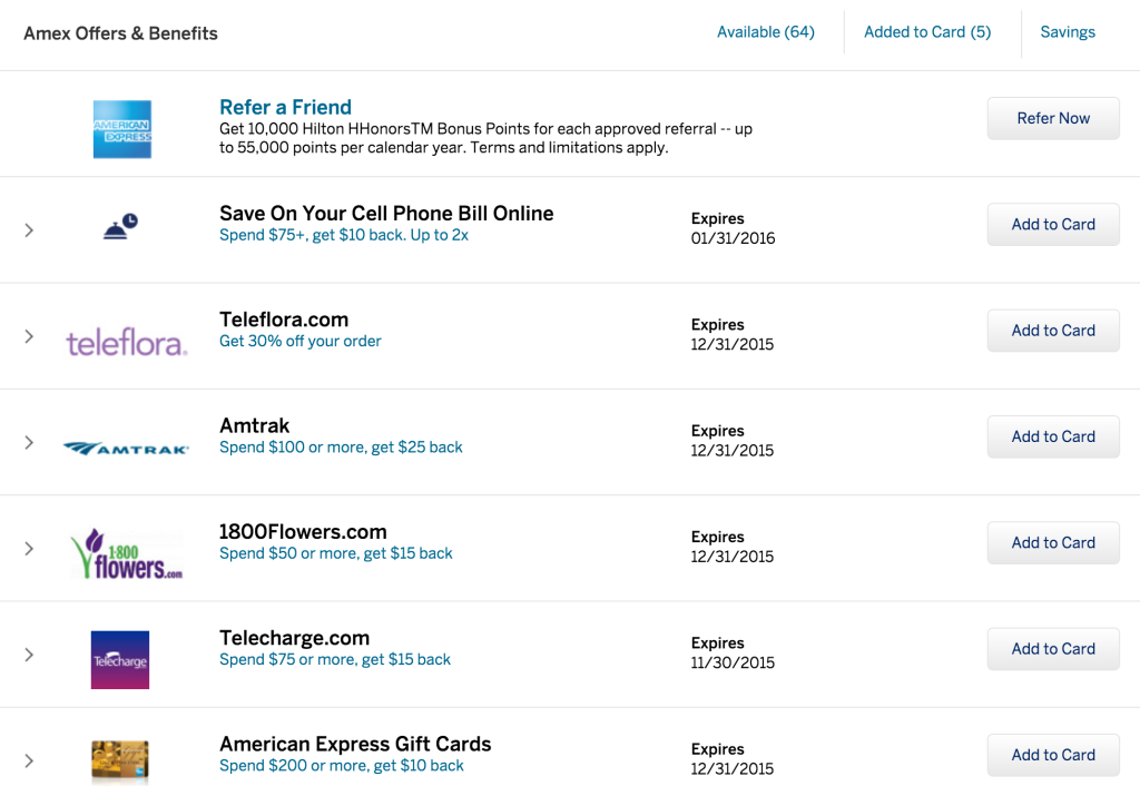
The Newest Amex Offers Page!
But, Amex Offers 3.0 (or maybe 2.1?) is a marriage of both designs and for the good. It is back to a vertical layout with a single Load More button that will show you every offer on the same page. Not only that, but the store logos are still there so that you can scan through for your favorite offers. Now, you can open each tab for separate cards, hit the Load More button, and just scroll through your tabs in seconds to save all the offers of interest.
Summary
As someone who spends a moment (or two) every day on the Amex Offers page, I am very glad to see the new design. American Express obviously realized that it was a good move for consumers while also retaining their fresh look from the second design. Thankfully, we can bank those extra seconds/minutes each day now that we went through saving offers as the single page view makes it much easier. And, of course, if you are looking for a single offer, the Find function in your browser works again since it is all on one page – making it very quick and easy!


