Don’t forget to enter the giveaway for the perfect travel accessory!
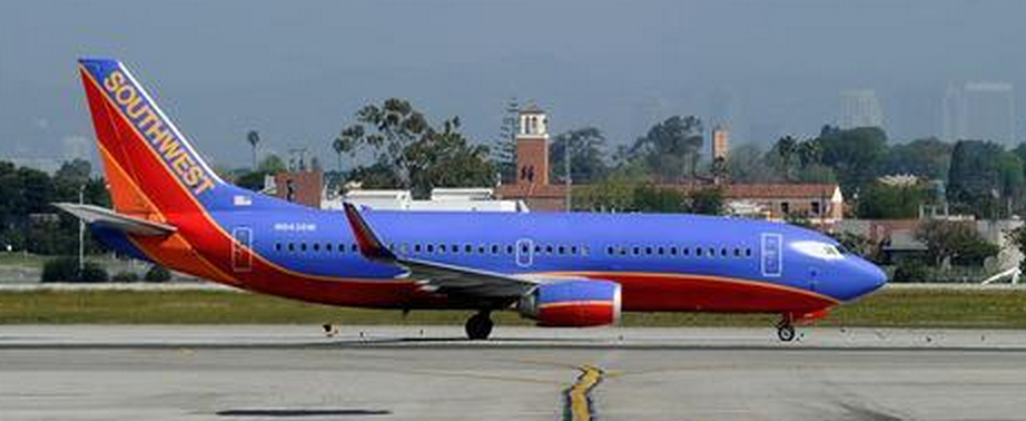
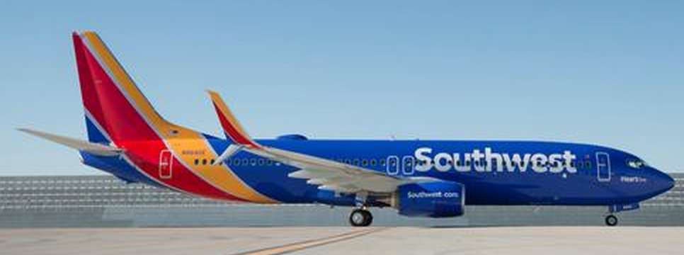
Southwest, as reported widely last week, is the latest of the airline carriers to roll out a new branding of the colors that appear on their aircraft. American Airlines did that before with United and Delta happening before that. Do the colors of airlines really matter that much? Is it a subliminal thing for customers to be drawn to something that looks like a Crayola exhibit? (For the record – I like the colors!)
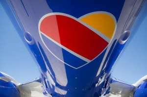
Southwest is really making a big effort to connect on a deeper level with passengers by going so far as to use a heart to express their LUV (their word and stock symbol) for passengers. At least from the aspect of media exposure, it has seemed like it has been taken very favorably with stories still being written about the change and commercials still airing as prime spots. Of course, I would rather them use the money to drop their fares even more, but they say that the rebranding was actually a revenue neutral move. The commercials on the other hand, they cost a little bit more. 🙂
I certainly am not slamming it as I do think the colors are really bold and articulate – it looks very 201- era as entertainment displays pop out vibrant colors more than ever and the old branding looks dull and washed out in comparison. It just makes me wonder if changing colors really makes that big of a difference and does it make people want to fly the airline that much more? If so, there are probably a few airlines that could benefit from a color change right about now…
